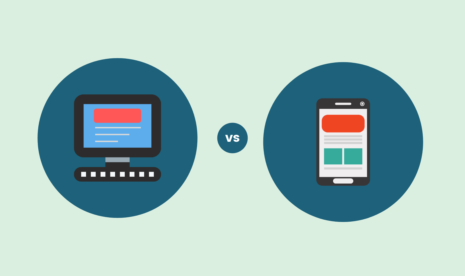
Mobile User Vs Desktop User: Resolving the Debate
Contributors:
Amol Ghemud
Published: August 14, 2018
The concept of “mobile-first” has gained significant attention recently, with notable instances in the eCommerce industry. In 2015, Myntra initially positioned itself as a mobile-only platform (later reverting to desktop due to consumer backlash). Around the same time, Flipkart declared a mobile-first strategy but eventually opted for a more balanced approach.
It’s important to clarify that “mobile-first” extends beyond focusing on mobile app development. It involves designing UI/UX and branding, primarily focusing on the mobile device’s small form factor. This approach challenges the traditional path of starting with a website and extending to a mobile app. Instead, it prioritizes mobile as the primary platform and considers desktop a secondary option.
Now that we’ve clarified the essence of “mobile-first,” let’s delve into why some may view it as a less favorable idea, especially regarding mobile users vs. desktop users, the differences in mobile search vs. desktop search, and the dynamics of mobile vs. desktop eCommerce.
Managing Mobile – The Hidden Costs
Managing and promoting a mobile app can be more challenging and costly than it initially appears for startups. Before diving into the process, you must make crucial decisions, such as choosing between Hybrid and Native app development. It’s important to note that building an entire app ecosystem can incur significantly higher costs compared to creating a multi-platform web-based portal.
Once your mobile apps are launched, you’ll encounter further challenges. These include the often substantial marketing expenses associated with user acquisition and the complexities of user retention. Additionally, there’s the ongoing task of ensuring that most of your users consistently use your product’s latest version. This can become a particularly daunting endeavour for startups in terms of expenses and the required effort.
In the realm of mobile vs. desktop users, these challenges underscore the unique dynamics of managing mobile applications compared to web-based platforms.
Making Sense – What the heck is going on here?
When you take into account the conversion rates, it’s clear that the desktop holds a dominant position. Even tablets perform reasonably well in terms of conversion rates, but their traffic volume could be higher, making them less significant in the overall picture.
It’s crucial to emphasize that this article is not intended to be anti-mobile. Recent research indicates a dynamic and evolving cross-device user journey in eCommerce. Many shoppers now seamlessly switch between multiple devices to complete their purchase, highlighting the complex interplay between mobile users vs. desktop users, the nuances of desktop vs. mobile interactions, and the evolving landscape of mobile vs. desktop eCommerce.
The eCommerce landscape is evolving rapidly, and understanding the interactions between different devices and platforms is essential for businesses aiming to thrive in this dynamic environment.
39% shoppers use smartphones as final devices for purchase
This implies that although their shopping journey may have started on a desktop site, the mobile platform serves as the ultimate point of purchase. In light of this trend, it’s increasingly essential for eCommerce portals to embrace cross-device customer journeys.
Suppose you’re in the process of launching a new e-commerce portal and are contemplating how Inbound Marketing can enhance your marketing efforts. In that case, it’s crucial to consider the interplay between mobile and desktop users and the dynamics of desktop vs. mobile interactions. While mobile should undoubtedly be a part of your long-term strategy, for an initial lean approach to Minimum Viable Product (MVP), it is more advantageous to focus on desktop users, where you can achieve better Return on Investment (ROI).
The advice is to “Go Mobile” but not necessarily adopt a “mobile-only/first” approach immediately. Balancing mobile and desktop strategies is crucial in catering to your target audience’s diverse preferences and behaviours in the mobile vs. desktop eCommerce landscape.
FAQs
1. What are the main differences in behavior and expectations between mobile users and desktop users?
Mobile Users vs. Desktop Users:
- Behavior: Mobile users tend to exhibit shorter attention spans and prefer quick, on-the-go interactions, while desktop users often engage in more extended sessions with focused tasks.
- Expectations: Mobile users expect responsive design, touch-friendly interfaces, and fast loading times, whereas desktop users may tolerate more complex layouts and prioritize comprehensive features.
Mobile Search vs. Desktop Search:
- Mobile Search: Mobile search queries often include location-based intent, voice search, and questions, reflecting a need for immediate, local, or context-specific information.
- Desktop Search: Desktop search may involve broader research, multi-tab browsing, and complex queries, often for tasks that require in-depth exploration or comparison.
Mobile vs. Desktop E-commerce:
- Mobile E-commerce: Mobile users typically seek streamlined, mobile-optimized shopping experiences with easy navigation, simplified checkout processes, and mobile payment options.
- Desktop E-commerce: Desktop users might engage in more extensive product research, utilize larger screens for detailed product views, and prefer traditional payment methods or comprehensive features.
2. How does responsive design contribute to providing a seamless experience for both mobile and desktop users?
By addressing the unique demands and preferences of different user groups, responsive design plays a critical role in ensuring a seamless experience for both mobile and desktop users:
Mobile Users vs. Desktop Users:
- According to the user’s device, responsive design modifies the layout and content presentation to enhance the user experience for desktop and mobile users.
- Responsive design accommodates mobile users’ on-the-go behavior by ensuring that the material is easily viewable, touch-friendly, and fits different screen sizes.
- To make the most of the bigger screen real estate available to desktop users, responsive design maintains an interface that is aesthetically pleasing and easy to use.
Desktop vs. Mobile:
- Responsive design is used to make navigation menus, buttons, and other interface elements easy for touchscreen input on mobile devices and precise mouse input on desktops.
- While responsive design stacks and reorganizes content for a more vertical scroll experience on mobile devices, it ensures that content is well-structured on desktops to make it easier for users to assimilate information.
Mobile Search vs. Desktop Search:
- Responsive design improves search functionality by ensuring that search bars and filters are visible and work on all devices.
- Responsive design for mobile search concentrates on optimizing the display of search results, making sure they are quickly scanned and engaging.
- Refinement of user queries is improved for desktop search because of responsive design’s abundant area for sophisticated search capabilities like filters and sorting choices.
Mobile vs. Desktop E-commerce:
- With streamlined product listings, user-friendly shopping carts, and mobile payment choices, responsive design simplifies the purchasing process for mobile e-commerce.
- The responsive design preserves the integrity of product displays in desktop e-commerce, enabling high-quality photos, thorough product descriptions, and more complex checkout procedures.
3. What factors should businesses consider when deciding which features to prioritize for mobile users versus desktop users?
When deciding which features to prioritize for mobile users versus desktop users, businesses should consider several key factors:
- User Behavior (Mobile Users vs. Desktop Users)
- Device Capabilities (Desktop vs. Mobile)
- Context of Use (Mobile vs. Desktop)
- Mobile Search vs. Desktop Search
- Mobile vs. Desktop E-commerce
- Screen Real Estate (Desktop vs. Mobile)
- Performance and Speed (Mobile vs. Desktop)
- Cross-Platform Consistency
- User Feedback and Testing
- Business Goals and ROI
- Technological Feasibility
- Competitor Analysis
4. Are there specific industries or types of content that tend to be more popular among mobile users as compared to desktop users?
Specific industries and types of content tend to be more popular among mobile users than desktop users due to the differences in user behavior, context, and preferences. Here are some examples:
- Social Media and Messaging (Mobile Users vs. Desktop Users)
- Local Services and Maps (Mobile vs. Desktop)
- Mobile Search (Mobile Search vs. Desktop Search)
- Entertainment and Streaming (Mobile vs. Desktop)
- News and Updates (Mobile Users vs. Desktop Users)
- Mobile Gaming (Mobile vs. Desktop)
- Mobile Shopping and E-commerce (Mobile vs. Desktop E-commerce)
- Health and Fitness (Mobile vs. Desktop)
- Travel and Booking (Mobile Users vs. Desktop Users)
- Food Delivery and Restaurant Reservations (Mobile vs. Desktop)
5. What are some common challenges faced by designers and developers when optimizing websites or apps for both mobile and desktop users?
Designers and developers face several common challenges when optimizing websites or apps for both mobile and desktop users:
- Responsive Design (Mobile Users vs. Desktop Users)
- User Interface (Desktop vs. Mobile)
- Content Prioritization (Mobile Search vs. Desktop Search)
- Performance Optimization (Mobile vs. Desktop)
- User Experience Consistency (Mobile vs. Desktop E-commerce)
- Navigation Challenges (Mobile Users vs. Desktop Users)
- Content Adaptation (Desktop vs. Mobile)
- Touch vs. Mouse Interactions (Desktop vs. Mobile)
- Search Functionality (Mobile Search vs. Desktop Search)
- Cross-Browser Compatibility (Mobile vs. Desktop)
- Data Usage and Loading (Mobile Users vs. Desktop Users)
- Testing and QA (Mobile vs. Desktop E-commerce)
- Performance Trade-Offs (Mobile vs. Desktop)
- Accessibility (Mobile Search vs. Desktop Search)
To effectively overcome these obstacles, designers, developers, and usability testers must work together to produce a smooth and user-friendly experience across all platforms. This demands a thorough understanding of mobile and desktop users’ unique needs and behaviors.
Read More:
Why CEOs of SME should Consider Inbound Marketing in 2023 to Grow their Business
Why CEOs of SME should consider Inbound Marketing in 2018 to grow their business
How Inbound Marketing can Help Small and Medium Scale Enterprises (SME) Grow
Smart Prospecting – Why Inbound Marketing is important for Business Owners.
Inbound Marketing Fundamentals You should Look out for in 2023
Which one to choose : Inbound Vs Outbound Marketing for Startups
About the Author
Optimizer in Chief
Amol has helped catalyse business growth with his strategic & data-driven methodologies. With a decade of experience in the field of marketing, he has donned multiple hats, from channel optimization, data analytics and creative brand positioning to growth engineering and sales.
 Growth Strategy and Planning
 Inbound Growth
 Growth Hacking
 Search Engine Optimization
 Paid and Performance Marketing
 Social Media Marketing
 AI-Driven Growth Strategy
 AI-Native Workflow Automation
 Growth Tools
 Offers


Leave a Reply