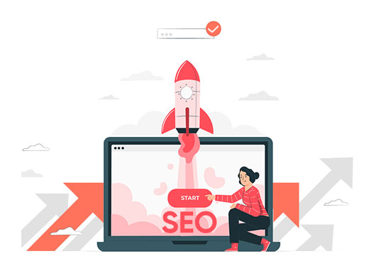
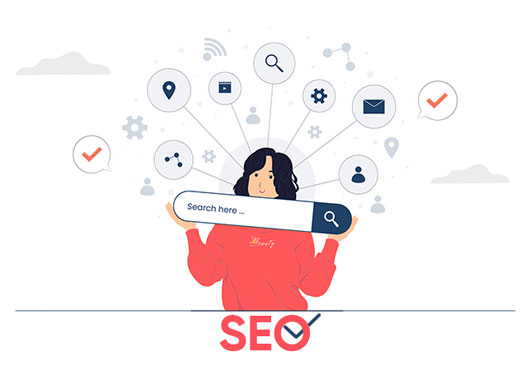
A brief overview of the importance of landing pages in digital marketing
In the dynamic realm of digital marketing, landing pages emerge as key protagonists, orchestrating the conversion of website visitors into valuable leads or customers. Serving as targeted havens, these well-crafted pages guide users toward specific actions that seamlessly align with the marketer’s strategic objectives. Despite earnest intentions, however, common pitfalls in landing page design can impede conversion rates, casting shadows on the effectiveness of these digital gateways.
Introduction to common mistakes that can hinder conversion rates.
Overloading with Information
Keep It Simple:
One of the standard landing pages mistake is providing too much information, leading to cognitive overload. This can be confusing for users, leading them to lose direction.
Prioritize Key Messages:
To prevent this, it is advisable to prioritize essential messages that resonate with the intended audience.The fallacy that more information equates to heightened engagement often underlies these landing page design mistakes.
Use Bullet Points and Headers:
By employing the organizational prowess of bullet points and headers, content becomes digestible, enhancing both readability and emphasizing vital information.
Lack of Clear Call-to-Action (CTA)
Make CTA Prominent:
A prevalent landing page design mistake surfaces when the call-to-action (CTA) needs more clarity and prominence. Just as a guidepost directs travelers, a CTA should unequivocally steer users toward the desired action.
Use Action-Oriented Language:
The crafting of CTAs demands finesse, employing action-oriented language that compels users to embark on the desired journey. Strategic incorporation of keywords like “Get Started,” “Subscribe Now,” or “Download Today” imparts clarity and urgency.
Limit to One Primary CTA:
To avoid confusion, limiting CTAs to one primary action is strategic. Multiple CTAs can dilute focus, precipitating a decline in conversion rates.
Ignoring Mobile Optimization
Responsive Design:
A cardinal sin in landing page design is disregarding mobile users, a significant faux pas in the digital landscape. The adoption of responsive design ensures a seamless user experience across diverse devices.
Fast Loading Times:
In the realm of mobile users, speed is of the essence. Optimization for fast loading times becomes imperative, catalyzing reducing bounce rates and enhancing overall user satisfaction.
Mobile-Friendly Navigation:
Simplifying navigation for mobile users becomes an art, necessitating intuitive buttons and a user-friendly layout. The oversight of mobile optimization may result in missed conversion opportunities.
Slow Page Loading Speed
Optimize Images:
The critical weakness of any landing page is its slow loading speed. Optimizing images strategically, along with intelligent use of keywords, not only boosts speed but also improves SEO.
Minimize HTTP Requests:
The orchestration of a seamless user experience involves minimizing the number of HTTP requests by optimizing scripts and stylesheets. This dual approach accelerates loading speed and elevates the overall user experience.
Use a Reliable Hosting Service:
At the core of a well-optimized landing page lies the choice of a reliable hosting service. A slow or unreliable server is the nemesis, which can undermine all optimization endeavors and lead to lost conversions.
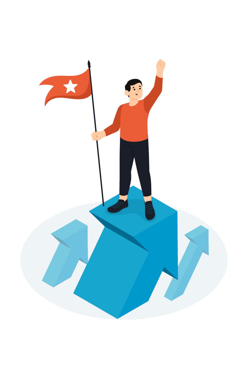
In essence, the journey towards digital marketing success is intrinsically tied to the efficacy of landing pages. Recognizing and rectifying these typical landing page design mistakes becomes paramount, ensuring a harmonious user journey and maximizing the impact of digital marketing endeavors.
Using Generic or Uninspiring Headlines
Be Specific and Relevant:
Embarking on a successful digital journey requires steering clear of the biggest landing page mistakes, and chief among them is the pitfall of generic or uninspiring headlines. To captivate your audience, specificity, and relevance are your guiding stars. Craft headlines that speak directly to users’ needs and aspirations, vividly depicting what awaits.
Create a Strong First Impression:
The headline isn’t merely a string of words; it’s the gateway to your content. Its role is to create a lasting first impression. It is a profound landing page design mistake to underestimate the impact of your headline. A compelling headline entices users to delve deeper into the tapestry of your landing page, eager to discover more.
Test Different Headlines:
In the dynamic landscape of digital marketing, testing different headlines is your compass. Embrace the power of A/B testing to discern which headlines resonate most effectively with your audience. Continuous refinement becomes the antidote to the biggest landing page mistakes surrounding headline choice.
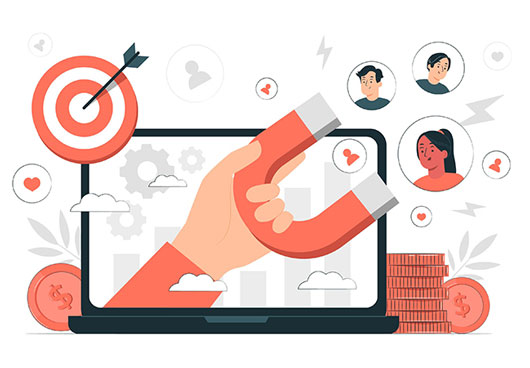
Not Showcasing Trust Signals
Include Testimonials:
Building trust is pivotal. Testimonials from satisfied customers serve as powerful trust signals. Incorporate these snippets strategically to alleviate doubts and instill confidence.
Display Certifications/Badges:
Visual endorsements of credibility come in the form of certifications and badges. Including these in your landing page design reinforces trust and validates your offerings, steering clear of the biggest landing page mistakes that undermine credibility.
Use Case Studies:
In the digital world, case studies offer concrete evidence of your product or service’s effectiveness. They become indispensable trust-building elements, fostering confidence and overcoming skepticism.
Poor Use of Visuals and Colors
High-Quality Relevant Images:
Visual appeal is the linchpin of effective landing page design. Opt for high-quality, relevant images that resonate with your brand and convey your message. The biggest landing page mistakes often stem from visual choices that must align with the audience’s preferences.
Consistent Color Scheme:
Colors are not just hues; they evoke emotions and perceptions. Maintain a consistent color scheme aligned with your brand identity. Inconsistency in color choices disrupts the visual harmony of your landing page, constituting a landing page design mistake.
Avoid Overuse of Stock Photos:
While stock photos can be convenient, overusing them dilutes authenticity. Balance is critical; blend authentic images with stock photos judiciously to strike the right chord and circumvent the biggest landing page mistakes.
Overcomplicated Forms
Limit Form Fields:
Forms are gatekeepers to conversions, but an overcomplicated form can be a significant deterrent. Limit the number of form fields to the essentials, asking only for information crucial to your conversion goals.
Use Progressive Profiling:
Ease the journey for users with progressive profiling. Instead of bombarding them with extensive forms, gather information gradually across multiple interactions. This makes the process more manageable and user-friendly, preventing landing page design mistakes.
Clear Error Indicators:
Navigating a form should be seamless. Provide clear error indicators and concise instructions to guide users through form-filling. Poor use of forms is a typical landing page design mistake that can impede conversions.
Conclusion
Creating effective landing pages requires a keen understanding of user psychology and strategic design choices in the intricate tapestry of digital marketing. By steering clear of the biggest landing page mistakes, your landing pages captivate and convert, paving the way for digital marketing success.
FAQs
1. What key elements contribute to a well-designed landing page, and how can their absence hinder conversions?
Critical Elements for a Well-Designed Landing Page:
Compelling Headlines:
Picture a well-designed landing page as a captivating story, and its headlines are the opening lines that enthrall the reader. The absence of compelling headlines risks user disengagement, like a book without a hook.
Consistent Messaging and Visual Identity:
In the ballet of digital marketing, harmony is vital. Consistent messaging and visual identity between ad campaigns and landing pages are the dancers maintaining synchrony. Discrepancies, the biggest landing page mistakes, disrupt this dance, causing confusion and hindering conversions.
Clear Call-to-Action (CTA):
At the heart of conversion lies a conductor orchestrating the user journey – the clear call-to-action (CTA). The absence of this guiding force is one of the biggest landing page mistakes, leaving users adrift without a clear path forward.
Optimized Loading Speed:
In the digital race, speed is the tempo. Slow-loading pages act as an unwelcome pause, impacting user experience and conversions. Optimization becomes the composer’s wand in landing page design, preventing the detriments associated with sluggish loading.
2. How does a lack of clear and compelling headlines impact the effectiveness of a landing page?
Impact of Absent Compelling Headlines:
User Disengagement:
A landing page without a clear, compelling headline is like a silent overture. Absent effective headlines, users need more incentive to explore further, resulting in a missed opportunity for conversion.
Loss of Initial Impact:
Headlines, the first notes of the symphony, create the initial impact. A compelling headline is necessary to diminish this impact, potentially deterring users from delving deeper into the melodic landing page.
Reduced Click-Through Rates:
A lackluster headline fails to entice clicks, leaving the audience wanting. Click-through rates suffer when headlines fail to resonate with users’ needs and aspirations, constituting a classic landing page design mistake that hampers the entire composition.
3. Why is maintaining a consistent message and visual identity between ad campaigns and landing pages important?
Consistent Messaging and Visual Identity Importance:
User Confusion:
Users anticipate a seamless act in the grand performance from the ad to the landing page. Consistent messaging and visual identity must be clarified for the user’s immersive experience and hinder the conversion journey.
Lost Trust:
Trust is the delicate melody in the digital landscape. A disconnect between an ad and its corresponding landing page erodes this trust. Users may perceive it as a discordant note, resulting in lost trust and diminishing conversion potential.
Reduced Brand Impact:
Consistency, the conductor’s baton, reinforces brand identity. When the message and visuals align seamlessly, brand impact is magnified. The landing page design mistake of inconsistency dilutes the brand’s effectiveness, possibly leading to missed conversion opportunities.
4. How can slow-loading landing pages negatively affect user experience and conversion rates?
Negative Impact of Slow-Loading Pages:
User Frustration:
Slow-loading pages are a dissonant note in the symphony, breeding user frustration. In a world accustomed to instant gratification, delays breed discontent. The negative impact on user experience is one of the biggest landing page mistakes that drive users away.
Increased Bounce Rates:
Users, like impatient concertgoers, are quick to abandon ship when faced with sluggish loading times. High bounce rates are the cacophony resulting from slow-loading pages, hindering the conversions the landing page seeks to achieve.
SEO Consequences:
Search engines, akin to music critics, penalize slow-loading pages. A decrease in visibility compounds the negative impact on conversion rates. It’s a dual blow, affecting user experience and SEO performance in the symphony of landing page brilliance.
5. What role does the absence of a strong call-to-action (CTA) play in diminishing the conversion potential of a landing page?
Role of Absent Strong Call-to-Action (CTA)
User Indecision:
A landing page without a clear CTA leaves users in suspense, like a musical piece without a defined rhythm. The absence of a strong CTA is a conversion roadblock, leaving users uncertain about the next steps.
Missed Conversion Opportunities:
The ultimate crescendo of a landing page is conversion. A strong CTA is necessary to ensure this crescendo, leading to missed opportunities. Users may leave without taking the desired action, rendering the landing page less effective in its composition.
Unclear Path Forward:
Like a guiding musical score, a CTA provides a clear path forward for users. A strong CTA is necessary for users to understand the following steps, contributing to the biggest landing page mistakes that diminish the symphonic conversion potential.
In the grand symphony of landing page design, these key elements are the notes that compose a harmonious user journey. Recognizing and rectifying the biggest landing page mistakes ensures a captivating landing page and a resounding pathway to digital marketing success.
Amol has helped catalyse business growth with his strategic & data-driven methodologies. With a decade of experience in the field of marketing, he has donned multiple hats, from channel optimization, data analytics and creative brand positioning to growth engineering and sales.
 Digital Marketing Bootcamp
 Go-To-Market Strategy
 Growth Hacking
 Family Owned Business
 Organic Growth
 Paid Growth
 Inbound Growth
 Social Growth

 Case Study
 Custom GPT's


Leave a Reply