Explore the Google Bubble Chart as an innovative tool for SEO and growth strategists to analyze and optimize website performance. It provides a detailed overview of the chart’s functionality, including its ability to display data based on device type, query, and country, and its usefulness in identifying trends and areas for improvement. The article also offers guidance on customizing and interpreting the chart to make informed decisions about SEO strategies.
In This Article
Share On:
So you’re an SEO strategist/growth strategist and you are putting your heart and soul into getting your website – or your client’s website – the best possible page rank and traffic. And while you see results and traction, there is always room to improve. To take a step back, analyse what’s not working, what is working, and capitalise on it.
But to strategize effectively, you need to be able to see your data from more than just one angle. You need to look at CTR, geographies, total clicks, devices and more, so that you have a holistic picture.
Analysts like you would have to take separate data points, compile them into a format which would be easy to understand and access, and then get to work on analysis and strategy. Phew!
But the folks at Google are all about organising the world’s information better…and that includes your website performance information too!
Google has rolled out a great new feature: the templated, easy to load Bubble Chart, which presents data in a cohesive manner which gives you a broad overview and allows you to dig into finer details.
The Google Bubble Chart
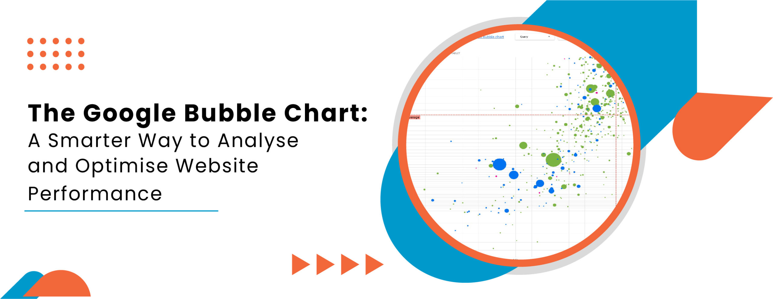
A bubble chart is a data visualisation tool, much like graphs, bar charts and pie charts. It is especially helpful when you have multiple metrics and dimensions to account for/keep track of, because it helps you see relationships and patterns in your data more effectively.
The Google Bubble Chart gives you search data and website performance data based on device (desktop, mobile, tablet) along with query and country, plotted along an X and Y axis. (X axis = site CTR, Y axis = Average position).
And Google has given users a really sweet deal: they’ve made their bubble chart in a ready to use format for all users of the Google Search Console. Simply head over to the template they have created, add your data, and voila! You’ve got a data-rich bubble chart.
(Google has a detailed blog post on how to connect Search Console to Data Studio to build a data visualisation that works for you, along with tips on how to enhance that data. You can read it here.)
The Bubble Chart Key
Since you may be new to this, we thought we’ll break down what you see. Here’s a little guide or “map key” of sorts to the elements in the Google Bubble Chart.
X axis at the bottom = site CTR.
Y axis along the side/length = Average position.
Bubbles/dots = search queries
Colour of the bubbles/dots = type of device. Green for desktop, blue for mobile, pink for tablet.
Size of the bubbles/dots = total no. of clicks
Red line = average for each axis
Quadrants = the four types of query performance (high and low CTR, position).
Customization Options and Filters
Once you have loaded your data into the chart, Google makes it easy for you to find what you are looking for. The data can be filtered based on the following:
Data control: Which Search console property do you want to analyse?
Date range: The default setting shows the previous 28 days, but you can set it to the dates you like.
Query: Add or remove queries you would like to focus on.
Country: Add or remove countries from the analysis.
Device: Add or remove device categories from your chart.
Analyzing the Data
The red lines dissect the chart into 4 sections or quadrants. These four sections can be used to analyse and help you decide where to invest your time when you optimise query performance.
Section 1, aka top position and high CTR: This shows up on the top right of the chart. This is your sweet spot. These queries are optimised and performing well!
Section 2, aka low position and high CTR: This shows up on the bottom right side. These queries hold opportunities. They are relevant to users and get a high CTR even though they rank lower than other queries on your page. Optimise and you shall reap the rewards and drive traffic!
Section 3, aka low position and low CTR: Showing up on the bottom left of the chart, these queries may look like a waste of time but there is room for improvement. First look at related queries: if the query is important to you, it might be a good idea to prioritise them over queries that don’t appear in Search results. Then take a look at any unrelated queries. This may be an indication that your content needs some fine-tuning or refining.
Section 4, aka top position and low CTR: This appears on the top left of the chart. You are ranking well for these queries but need to step it up to ensure a better CTR. Maybe your competitors have a better structured data markup. Maybe you are ranking for a query that is unrelated to your site. Or maybe users found that information elsewhere (like your company’s address or phone number).
The Next Steps
So, what next? Once you study the bubble chart and identify the queries and terms that will be worth investing in to boost your site performance, you further optimise them by ensuring that your titles, description meta tags and alt attributes are specific and accurate.
The data gathered will also help you incorporate the right queries to structure your page better, making it easier for users to navigate the page. Adding and modifying structured data markup to describe your content to search engines will help display your content in useful and attention-grabbing ways in search results.
How the Bubble Chart Will Help Analysts
For one, it’s an easy to follow visual representation of your website performance and search data that gives you a broad view of who’s clicking on what (and from which device!) at a glance.
Google also offers tips on how to use the bubble chart template to separate or isolate your critical data points.
You get to uncover multiple dimensions/metrics in one easy graph, which loads automatically (thanks to the template) once you connect your Search Console to Data Studio. Prior to the launch of the Bubble Chart feature, web and SEO analysts had to rely on third-party tools to create and plot such a graph.
Why it Matters
SEO is not dead — and in our opinion, will likely not become obsolete. For as long as there is Google search, businesses, creators and publishers will have to optimise their sites to make their content easy to find on the web.
The Google Bubble Chart will now make it easier for analysts and SEO specialists to check in and measure the effectiveness of their strategies and uncover better insights into user behaviour – and use those learning to course-correct and pivot if necessary.
Amol has helped catalyse business growth with his strategic & data-driven methodologies. With a decade of experience in the field of marketing, he has donned multiple hats, from channel optimization, data analytics and creative brand positioning to growth engineering and sales.
 Growth Strategy and Planning
 Inbound Growth
 Growth Hacking
 Search Engine Optimization
 Paid and Performance Marketing
 Social Media Marketing
 AI-Driven Growth Strategy
 AI-Native Workflow Automation
 Growth Tools
 Offers


Leave a Reply